Metal cladding is not just protection. It is a style and attitude. It transforms dull structures into modern marvels. Architects praise it. Builders love it. Homeowners admire it.
Selecting the right colour and finish, however, is not a random decision. It is a crucial design move. The wrong choice can ruin the harmony. So, let this guide unpack the world of colours and finishes in metal cladding for you. It explains their impact and shows how colour and finish are more than surface details. They are the soul of the structure’s personality.
First things first—
Why Colour Matters in Metal Cladding?
Colour communicates. It sets the mood and shapes perception. A bright red cladding can energise, a charcoal grey can ground, and a soft bronze can soothe. So, you must choose the right colour that speaks directly to your target viewer.
In architecture, colour affects temperature.
- Warmer climates: White or light silver can reduce heat buildup.
- Cooler areas: Black or deep green helps retain warmth.
Colour also defines contrast. If you want to highlight bold architectural lines, you can choose black against timber. For blending into the landscape, opt for earthy tones.
Popular Colour Families in Metal Cladding
1. Neutrals
Neutrals never go out of style. They include shades like white, grey, beige, and black. These colours offer timeless appeal and match almost any setting, residential and commercial buildings alike. They also offer easy maintenance, as dust and grime blend in more easily.
2. Earth Tones
Drawn from nature, these colours include rust, olive, sand, and ochre. They echo rocks, soil, and foliage, giving a warm, grounded feel. Buildings in rural or bush settings benefit from these tones. They help the structure nestle into the environment. Corten steel, for example, brings a rustic, weathered look.
3. Metallics
Metallic hues bring an air of sophistication and style. Brushed silver, bronze, copper, and gold dance with the light. They glimmer and gleam, crafting a luxurious ambiance. Yet, these striking shades demand a delicate touch. Overindulgence can lead to visual chaos. A metallic accent wall, for example, adds flair without going overboard.
4. Bold Colours
Some designers seek drama with bold colours. Bright blue, cherry red, forest green, and lemon yellow grab attention. These shades suit creative spaces or contemporary homes. But they must be used strategically. Too many bright panels can cause visual chaos, whereas a single bright feature wall can spark energy.
The rule is to choose bolds to highlight, not to dominate.
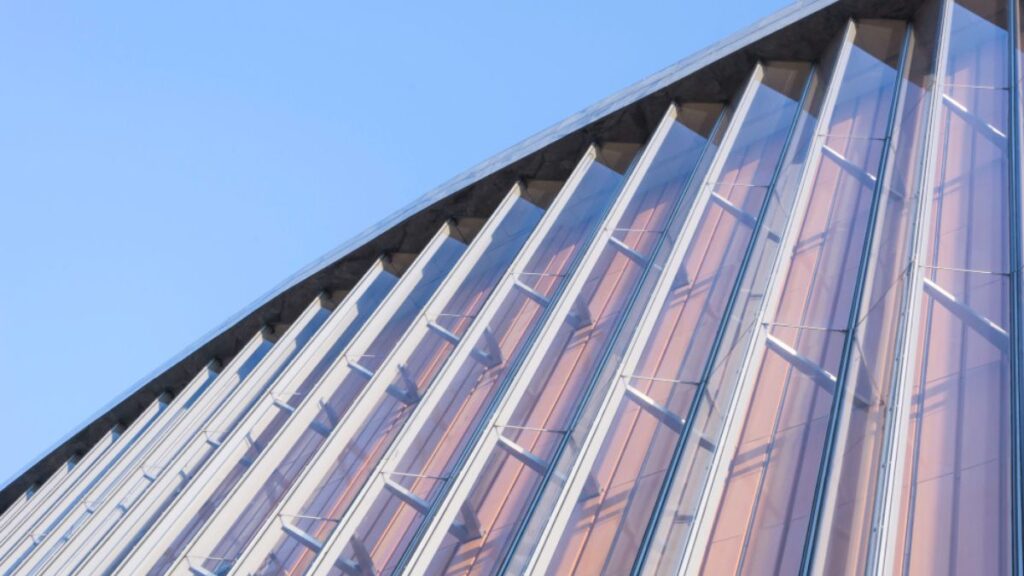
Finish Options and Their Effects
Colour tells only a part of the story. Finish tells the rest.
The same colour in different finishes can create totally different effects.
1. Matte Finish
Matte is smooth but non-reflective. It has a soft, powdery appearance. Its benefits:
- Feels calm
- Reduces glare
- Hides surface imperfections
- Blend easily into natural landscapes.
Matte finishes work well for understated designs. They also offer modern minimalism for urban facades.
2. Gloss Finish
Gloss adds sheen. It offers
- Light reflection
- Richer and deeper colours
- Bold and contemporary feel
However, gloss can show scratches and needs regular cleaning. Keep this in mind when choosing gloss for busy locations.
3. Textured Finish
Textured finishes add depth. They include finishes like woodgrain, ripple, or hammered effects. These surfaces offer tactile appeal. They add visual interest.
Textured finishes work well to disguise dirt or dents. They also mimic natural materials. For instance, a metal panel with a timber-textured finish offers the warmth of wood with the strength of steel.
4. Brushed or Satin Finish
Brushed finishes have fine lines etched into the surface. They look sleek. They resist fingerprints better than gloss. Satin strikes a balance between matte and gloss. They reflect light softly.
Brushed and satin finishes suit both residential and commercial builds. They are versatile. They enhance modern architecture without overpowering it.
How to Choose the Right Colour and Finish
A. Building Style
Modern homes suit dark matte or metallic finishes. Heritage homes look better with muted earth tones. Commercial buildings often lean towards gloss or satin with neutral palettes. Always respect the architectural character.
B. Location
In coastal areas, light colours reduce heat. They also reflect salt spray. In the countryside, earthy hues blend better. In cities, darker shades hide pollution marks. Climate, surroundings, and exposure all matter.
C. Function of the Building
Warehouses need durability. Public buildings need aesthetics and easy maintenance. Homes need balance. Consider what the building does before picking the finish.
D. Light Interaction
Explore the site throughout the day; witness the magic of light. Each hour offers a different palette. At dawn, colours whisper softly; at noon, they boast brilliance. Dusk arrives, and hues radiate with intensity. Reflectivity plays a starring role. Gather samples and let them shine outdoors!
E. Maintenance
Gloss requires cleaning. Matte hides grime. Textured surfaces trap dust but hide scratches. Choose a finish based on your willingness to maintain it.
Custom Colour Options
Sometimes the standard isn’t enough. Many manufacturers offer custom colours. You can match a company logo. You can mirror natural surroundings. You can even create a one-of-a-kind facade.
Custom colours cost more. They require careful planning. Always get a physical sample before placing the full order. Digital swatches can lie.
Examples of Smart Colour and Finish Pairings
- Charcoal Grey Matte on a Modern Home
Sleek. Understated. Complements glass and concrete.
- Copper Finish on a Cultural Centre
Striking. Warm. Ages gracefully over time.
- Satin Silver on a Commercial Complex
Professional. Clean. Reflects light gently.
- Textured Woodland Brown for a Country Retreat
Natural. Earthy. Blends with trees and soil.
Mistakes to Avoid
- Skipping Samples
Always test colours and finishes onsite. Lighting matters.
- Ignoring Compatibility
Some finishes don’t suit certain metals. For example, high gloss may not bond well with zinc.
- Overdoing It
Too many colours or finishes can confuse the eye. Keep it simple.
Final Thoughts
Metal cladding is a visual language. Colour is its tone. Finish is its texture. Together, they speak volumes. The right combination creates harmony, elegance, and functionality. So, choose wisely. For professional insights, contact the experts at Claddco.